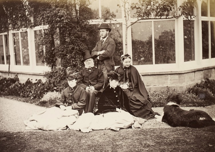
The collection forms part of our extensive holdings of family and estate papers relating to the historic East Riding of Yorkshire, and provides an unusually complete picture of a family in the 19th century as well as property records dating from the 15th century onwards. The Baines papers offer a rich opportunity to investigate the lives of a minor land-owning family in the 19th century, as well as the history of the villages represented in the property records.
Search FNL grants since 1931
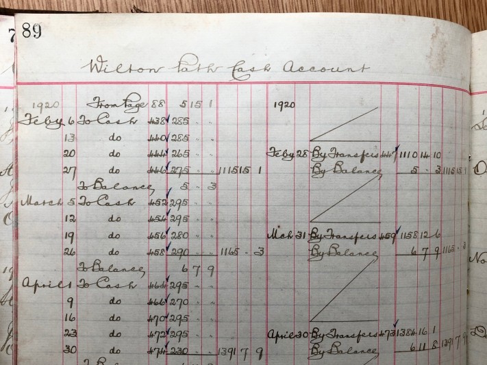
A set of volumes relating to the Dispatch Department that operated out of Peter Scott & Co. Ltd. Wilton Path factory, their main factory, was at Buccleuch Street, Hawick. They will improve understanding of the work of a major hosiery and knitwear company that operated from Hawick 1878-2016. It will also add to the records held on Wilton Path factory, which only operated for a relatively short time and of which little is known.
Sir Charles Lyell (1797-1875) is one of the most influential scientists of the last two centuries. His ground-breaking Principles of Geology (1830-33) showed that the earth is not shaped by sudden catastrophic events but by slow-moving forces, like erosion and sedimentation, that we can still see in action today. This collectioin documents Lyell’s wide-ranging activities including the publication of his books, his academic work at Cambridge University, and his geological research trips, they provide vivid evidence of contemporary reaction to his revolutionary ideas.
The library catalogue is compiled and indexed in George Campion Courthope’s distinctive hand, with later additions, probably by another family member. It is divided into the subjects Theology, Classics, History, Literature, Philosophy, Poetry, Science and Political Economy, Biography and Correspondence, and Travels and Voyages, reflecting the wide range of interests of its well-read author.
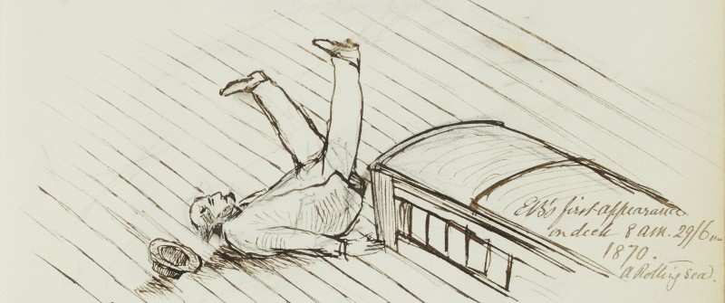
Edward Backhouse (1808-1879), prominent member of the well-known Quaker family, was born in Darlington but moved to Sunderland in 1816. He was a partner in the family banking business, Backhouse & Co (a founding company of Barclays Bank), but mainly engaged in philanthropic activities. Edward wrote ‘Early Church History’ and other religious works. This journal forms part of a series of diaries Edward kept, during family cruises on the Schooner Yacht Nereid around Scotland and Scandinavia, and European travels.
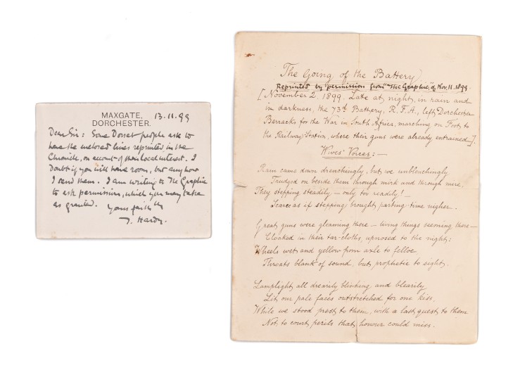
This collection was acquired to complement the principal Hardy archive, which is now on deposit at Dorset History Centre. It represents a major addition to the publicly-accessible Hardy archives and provides a fascinating insight into Hardy’s professional circle, his personal circumstances and his views and beliefs on a range of subjects. The material is made up of 46 separate elements, some of which contain multiple items. The bulk of the material was acquired between 1920 and 1970 and held as a single collection until this sale.
The account book belonged to William Walrond (1610-c.1667), a member of the Walrond family of Bradfield House, near Uffculme in mid Devon, and provides an unusually detailed insight into the operation of a significant country estate during the years following the English Civil War.
Maureen Selley, Secretary, writes: The North Devon Record Office in Barnstaple, Devon, holds some material relating to the North Devon Infirmary, but it has no list of subscribers or benefactors in its collections.
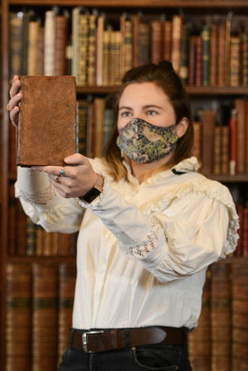
This rare first edition of William Cowper’s Poems, published in 1782, once belonged to Jane Austen’s brother Edward Austen Knight and was very likely read by Austen herself during her visits to her brother’s Kent estate. Edward inherited the estates of Chawton in Hampshire and Godmersham Park from wealthy relatives of his father; when he was made heir he took the name of Knight.
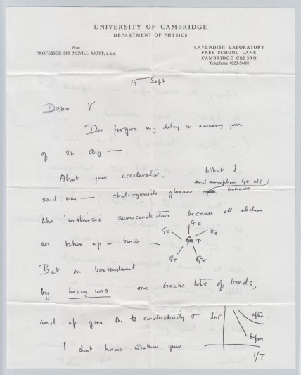
A collection of autograph letters from the Nobel Prize-winning physicist Professor Sir Nevill Francis Mott (Director of the Cavendish Laboratory, Cambridge, and Master of Gonville & Caius College) to Yvette Cauchois, a highly eminent physicist who became the second woman (after Marie Curie) to be President of the French Society for Physical Chemistry.
![Sketch of Byland Abbey, Ryedale, by Hewley John Baines while a pupil at Haxby School, August 1837 [U DDBH/27/3]. Courtesy of Hull University Archives. Sketch of Byland Abbey, Ryedale, by Hewley John Baines while a pupil at Haxby School, August 1837 [U DDBH/27/3]. Courtesy of Hull University Archives.](/sites/default/files/styles/large/public/U%20DDBH-27-3.jpg?itok=fqFgOYPg)
